Some months ago, I was lucky enough to attend a reading by Scott Momaday. He spoke like a man in the middle of a great love affair with the New Mexican landscape. The land was tied to his life; together their narrative extended thousands of years into the past. After the reading, I longed for a walk in the mortally beautiful mountains.
I live in the Scott Momaday New Mexico. The Rudolfo Anaya New Mexico. The Georgia O’Keeffe New Mexico. The Fred Harvey Company New Mexico. I do not live in newly rebranded “New Mexico True” setting that our tourism department has begun selling.
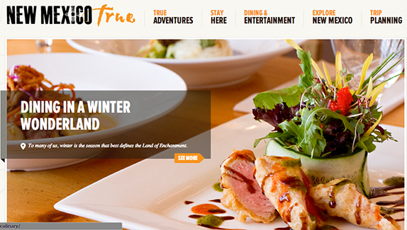
In case you have not seen the new logo, New Mexico is written in all caps in a black, eroded font, with the obligatory reversed-out sun symbol in the “I,” while true is written in a weathered, orange script. The combination of the fonts and erosion gives the impression of barnyard grunge; it’s the kind of logo that might advertise an FFA mixer or a new Chevy pickup.
On their own, the feel of the fonts would not be so bad, nor even the colors—perhaps it is time for us to step away from our turquoise and sun-drenched earth palette—but that pesky “true” bothers me a great deal.
The Land of Enchantment is too complex to be “true,” or by extension, “false.” Our truth is complicated because the state is built upon so many known secrets: ceremonies in kivas, labs and bombs, DARPA spy balloons, 101 falsified Hibben stories, buried treasure in the Bootheel, ditch witches and curanderas, identities of Billy the Kid or the San Miguel staircase carpenter…the list could continue well down the page. Saying that something is “New Mexico True” feels even more inauthentic given the whitewashed images that accompany their ads.
On the homepage, images flip between a photo of someone snowboarding, a family skiing, upscale cuisine, a tiny collage of New Mexican things (roadrunners, silver-turquoise jewelry, ristras) translating the 12 days of Christmas into local flair, an ad for the Goya collection at the New Mexico Museum of Art, and a shot of a film crew in golden hour light of Marlboro country. Some of these advertisements work—although there is the obvious timeliness problem with the holidays slide—but seem to reinforce an uncomplicated image of the state.
When I walk in the mountains, the landscape is mystical, not merely recreational. When I go out to eat, the next table over asks for chile, smothered Christmas-style over a burrito, not tempura-fried chicken breast with an arugula-caviar side salad. When family visits from the East Coast, they want cultural tourism, health and wellbeing, magic and serenity. They want to visit for what makes New Mexico different.


Responses to “Rebranding Enchantment”